Flyte Rebranding

Rebrand, 2024

My rebranding case study for a local nonprofit.
Flyte Rebrand presentation by Kiana Bartolome. Flyte (pronounced flight) is an acronym for Financial Learning You Take Everywhere.
Brief: Flyte is the only non-profit in the NOLA area with an extensive, virtual financial learning program that helps minority, small business owners prosper. Goal: to help Flyte better communicate its mission and more effectively reach its target audience by improving their branding.
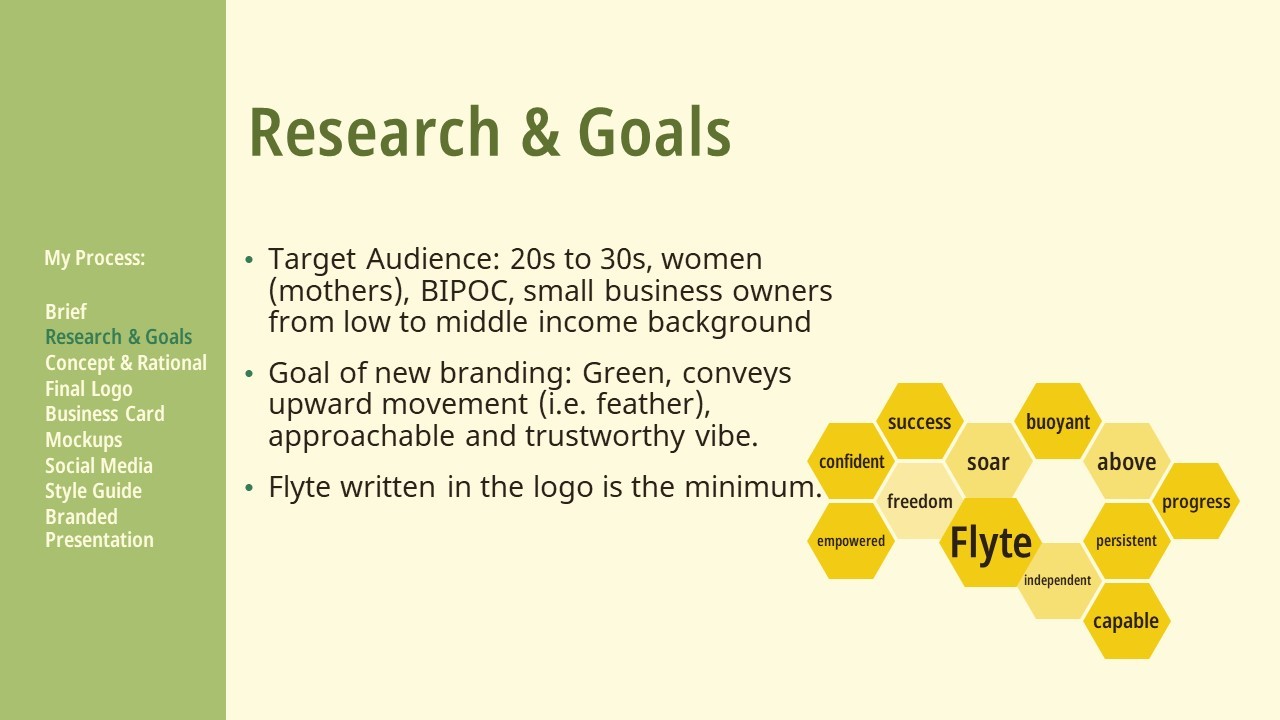
Research and Goals: Target Audience: 20s to 30s, women (mothers), BIPOC, small business owners from low to middle income background Goal of new branding: Green, conveys upward movement (i.e. feather), approachable and trustworthy vibe. Flyte written in the logo is the minimum. There is a word map for the word Flyte in the shape of a honeycomb. The words are sucess, confident, empowered, freedom, soar, buoyant, above, independent, capable, persistent, and progress.
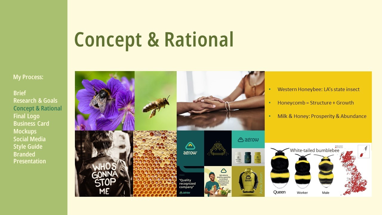
Concept and Rational: Louisiana's state insect is the Western Honeybee. Honeycombs represent structure and growth. Milk and honey represent prosperity and abundance. There is a moodboard demostrating female empowerment and connection, bees working and flying, the differences between white-tailed bumblees, and an example of the friendly graphics I want to emulate for this rebrand.
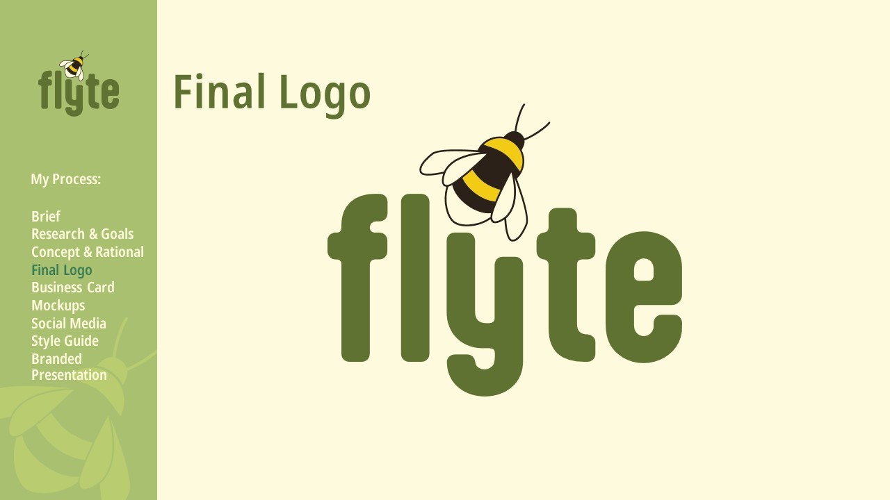
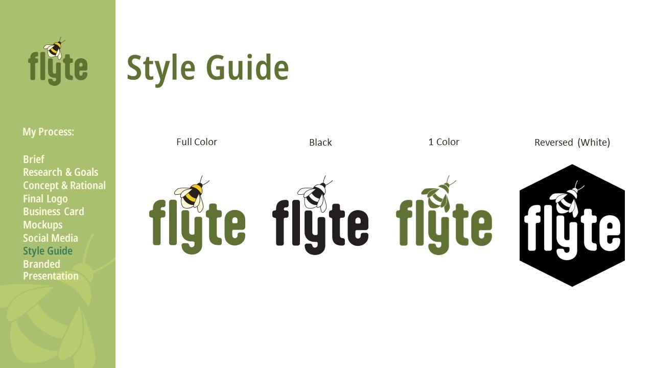
Final logo: Flyte is written in a rounded lowercase, with a bumblebee nestled above the Y, which is shortened. It is at an upwards angle, as if it is about to take off.
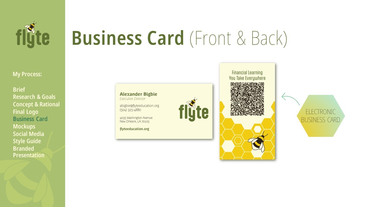
Front of business card is horizontal, has all the text to the left and the Flyte logo to the right. The back of the business card is vertical, with a QR surrounded by honycombs and featues the logo's bee. The QR code automatically adds the card's information to your phone's contacts, just in case you lose the business card.
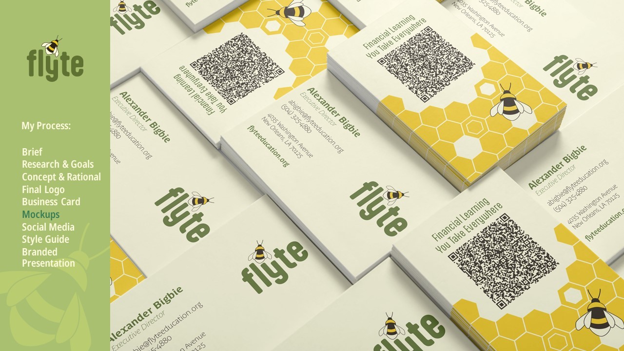
The business card mocked up.
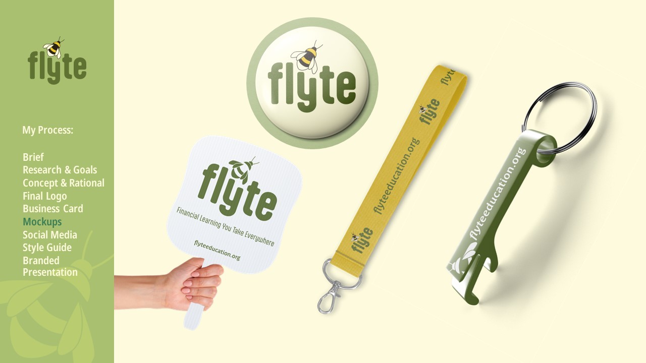
The new logo mocked up on a button badge, hand fan, short lanyard, and keychain bottle opener because these are items that companies typically make as freebies.

Video description: Two Instagram mockups, showing the rebrand in use. The square post advertises the Flyte Entrepreneur Empowerment Program, stating that “90% of participants’ credit scores increase. Of those, 68% saw it increase by at least 20 points.” The imagery features an irregular border of honeycombs that go from yellow to teal. The story post is an animation, with a different fact for the Entrepreneur Empowerment Program. A honeycomb fills up to 84% of its height as the Flyte honeybee wiggles.

WIP
WIP
WIP
WIP
WIP
WIP
WIP
WIP

Created in Illustrator.

Flyte Rebranding

Rebrand, 2024

My rebranding case study for a local nonprofit.

Flyte Rebrand presentation by Kiana Bartolome. Flyte (pronounced flight) is an acronym for Financial Learning You Take Everywhere.
Brief: Flyte is the only non-profit in the NOLA area with an extensive, virtual financial learning program that helps minority, small business owners prosper. Goal: to help Flyte better communicate its mission and more effectively reach its target audience by improving their branding.
Research and Goals: Target Audience: 20s to 30s, women (mothers), BIPOC, small business owners from low to middle income background Goal of new branding: Green, conveys upward movement (i.e. feather), approachable and trustworthy vibe. Flyte written in the logo is the minimum. There is a word map for the word Flyte in the shape of a honeycomb. The words are sucess, confident, empowered, freedom, soar, buoyant, above, independent, capable, persistent, and progress.
Concept and Rational: Louisiana's state insect is the Western Honeybee. Honeycombs represent structure and growth. Milk and honey represent prosperity and abundance. There is a moodboard demostrating female empowerment and connection, bees working and flying, the differences between white-tailed bumblees, and an example of the friendly graphics I want to emulate for this rebrand.
Final logo: Flyte is written in a rounded lowercase, with a bumblebee nestled above the Y, which is shortened. It is at an upwards angle, as if it is about to take off.
Front of business card is horizontal, has all the text to the left and the Flyte logo to the right. The back of the business card is vertical, with a QR surrounded by honycombs and featues the logo's bee. The QR code automatically adds the card's information to your phone's contacts, just in case you lose the business card.
The business card mocked up.
The new logo mocked up on a button badge, hand fan, short lanyard, and keychain bottle opener because these are items that companies typically make as freebies.

Video description: Two Instagram mockups, showing the rebrand in use. The square post advertises the Flyte Entrepreneur Empowerment Program, stating that “90% of participants’ credit scores increase. Of those, 68% saw it increase by at least 20 points.” The imagery features an irregular border of honeycombs that go from yellow to teal. The story post is an animation, with a different fact for the Entrepreneur Empowerment Program. A honeycomb fills up to 84% of its height as the Flyte honeybee wiggles.
WIP
WIP
WIP
WIP

Created in Illustrator.